Charity effectiveness research · UK
Do Gooder
A question about where donations actually go became a public database that grades UK charities on the accounts they file, not the adverts they run.
Choosing between two charities meant reading two sets of annual accounts. They are public, they are long, and they are written for a regulator rather than for a donor. The figures that reach the public get chosen by whoever is doing the fundraising.
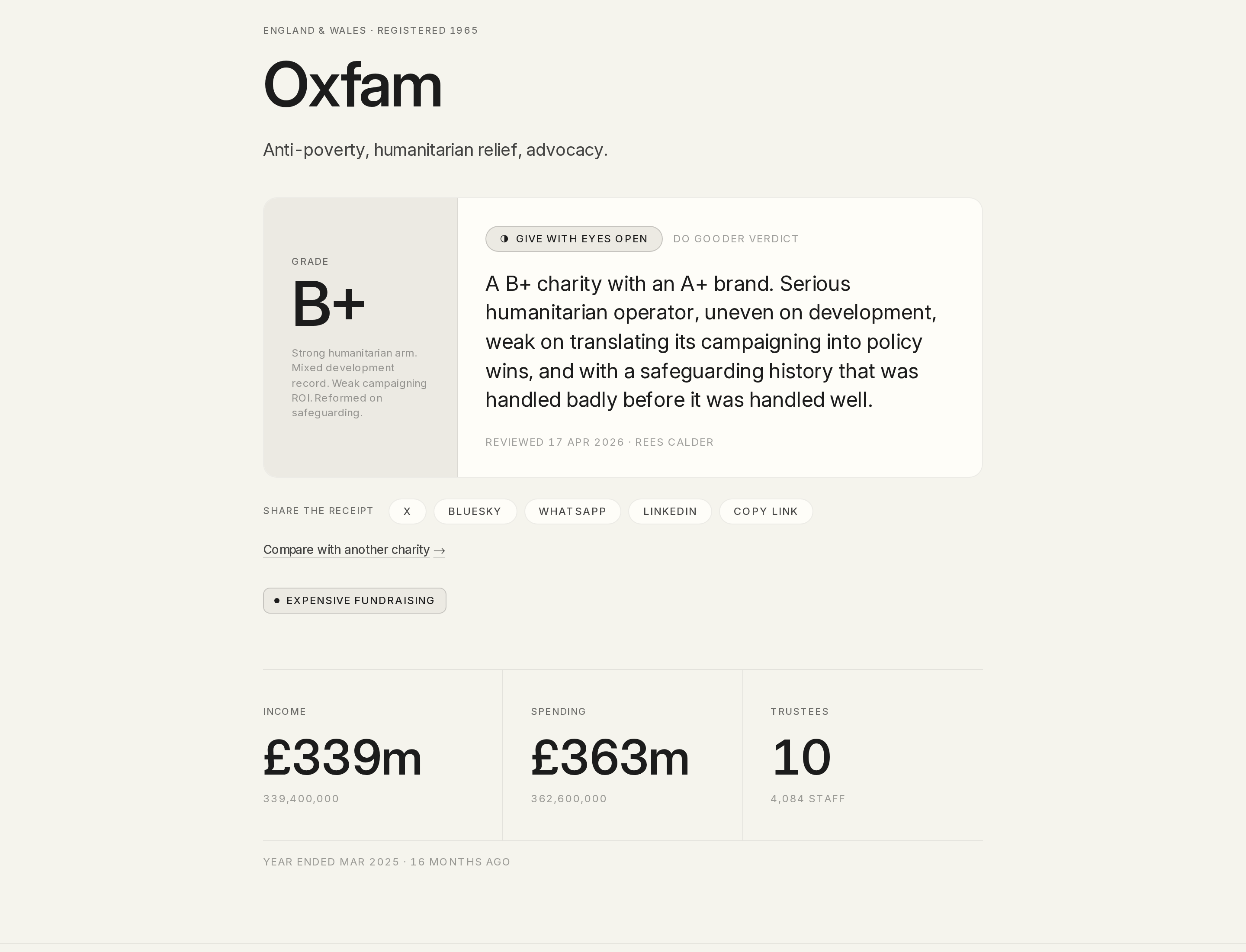
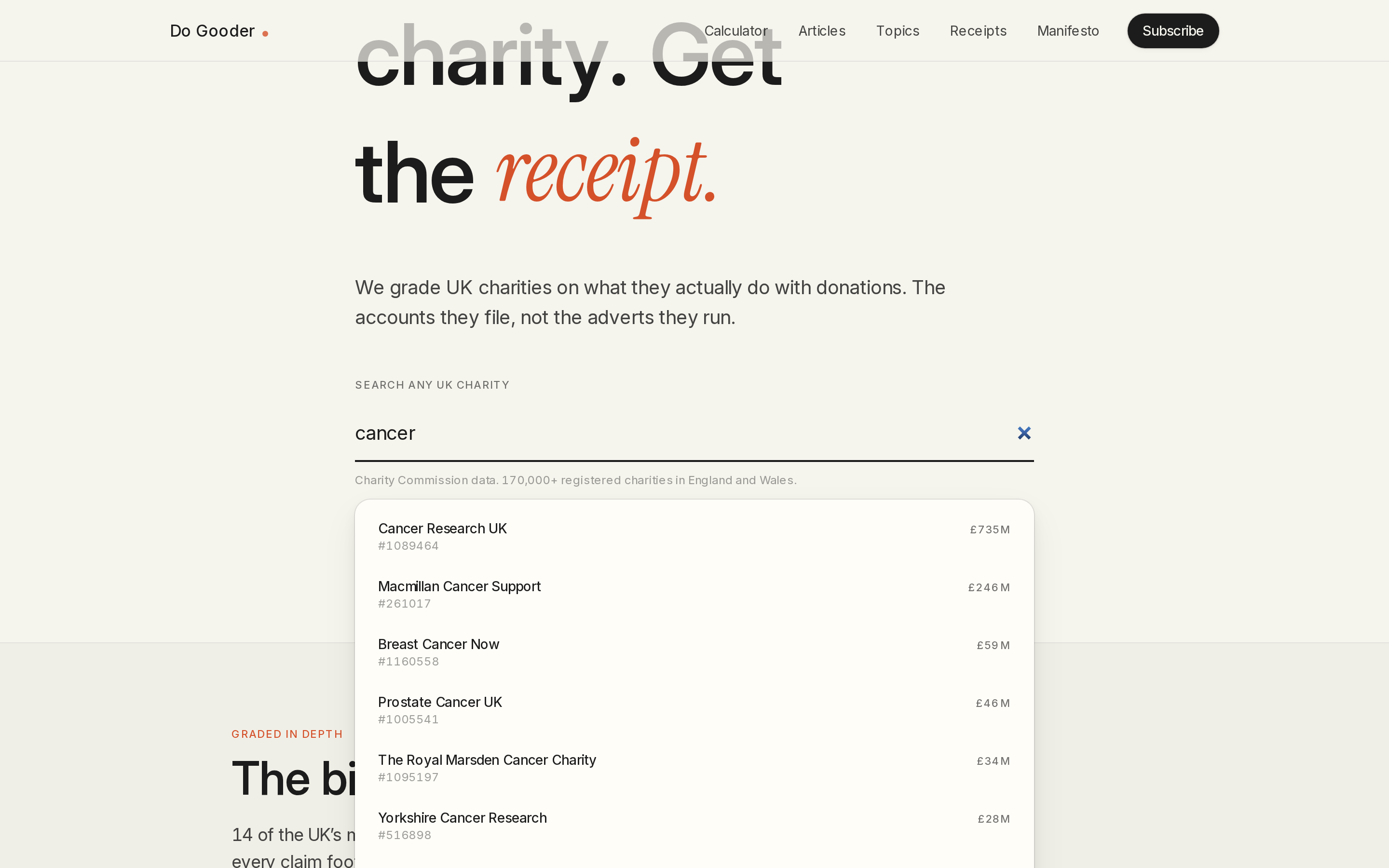
A search box over the register, fourteen charities graded on their filed accounts, every pair of them comparable side by side, and a rule set that publishes the threshold behind every flag it raises. Each grade is a page you can send someone.
- UK charities graded on their filed accounts
- 14
- head-to-head comparisons, every pair of the fourteen
- 91
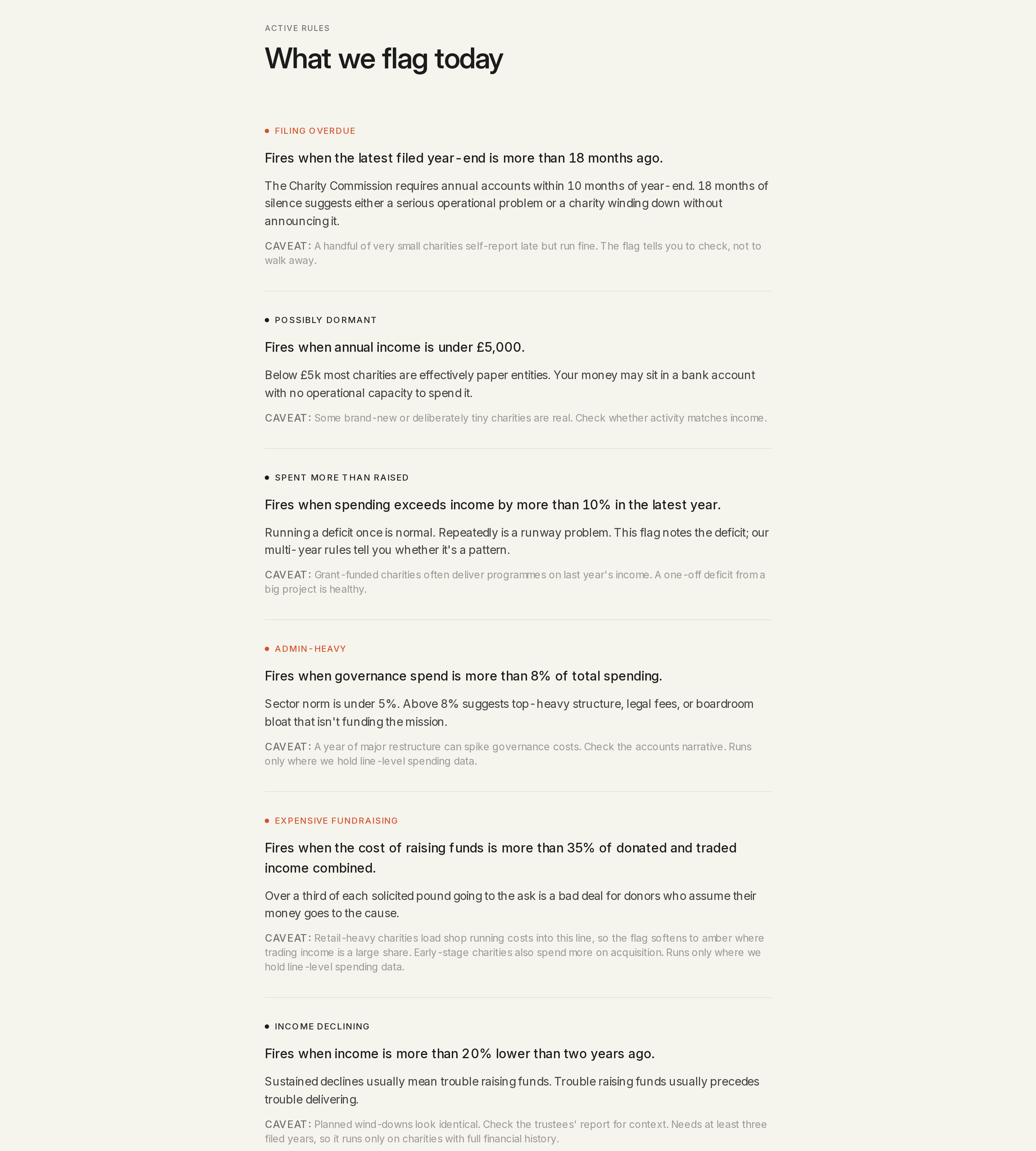
- live flag rules, each with its threshold published
- 6
The problem
The client wanted to answer a donor question and wanted the answer to exist in public rather than in a spreadsheet: how do you tell whether a large UK charity is actually any good at what it does? The Charity Commission already publishes what you would need, in that every registered charity files annual accounts and anyone can download them. Published is not the same as usable. The accounts run to dozens of pages, the figures worth comparing sit in different places in different filings, and the ratings the public actually reaches for are American and cover American charities. There was nowhere obvious to type a UK charity name and get a straight read on what it takes in, what it spends that on, and how it sits against the charity next to it.
What I built
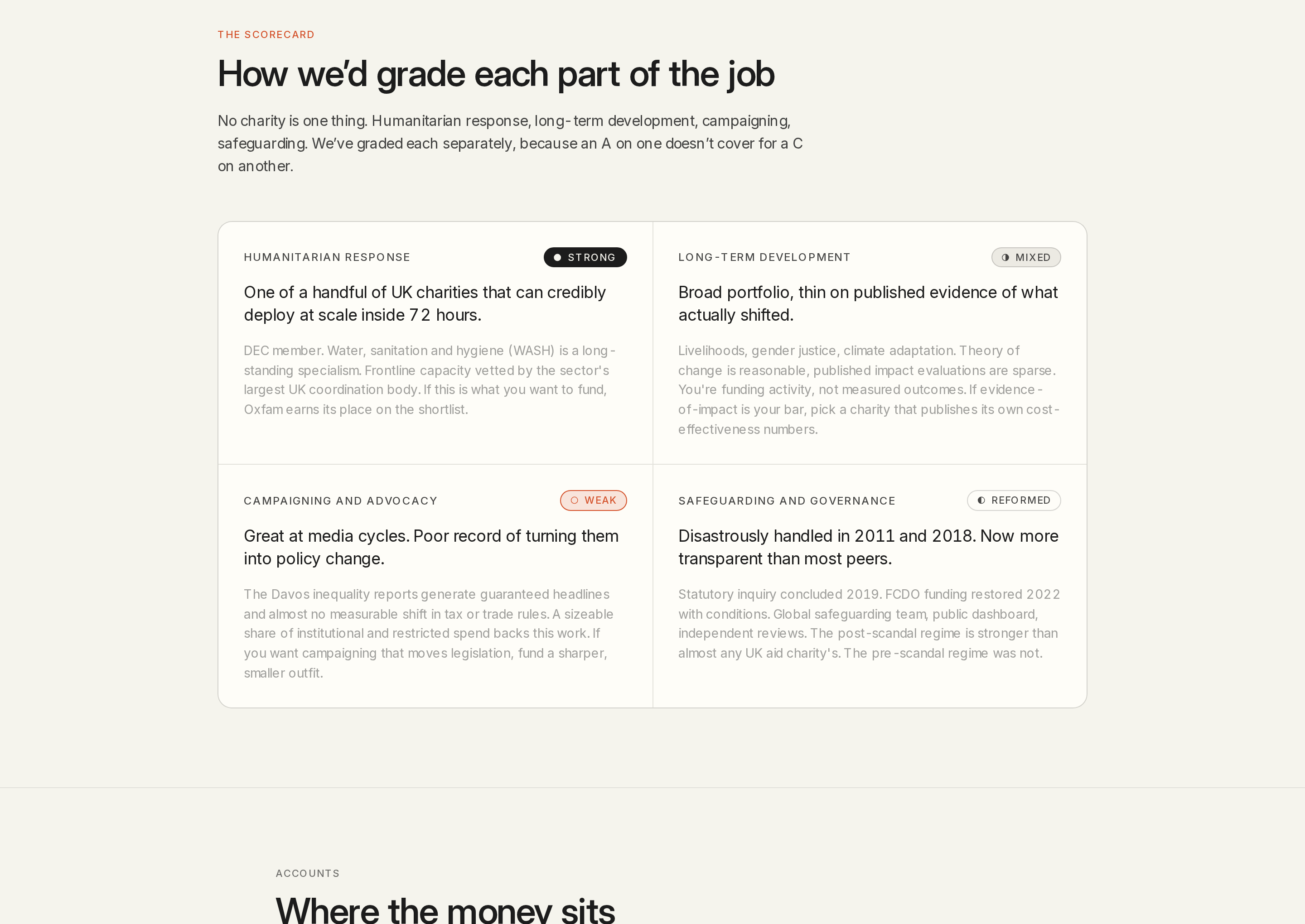
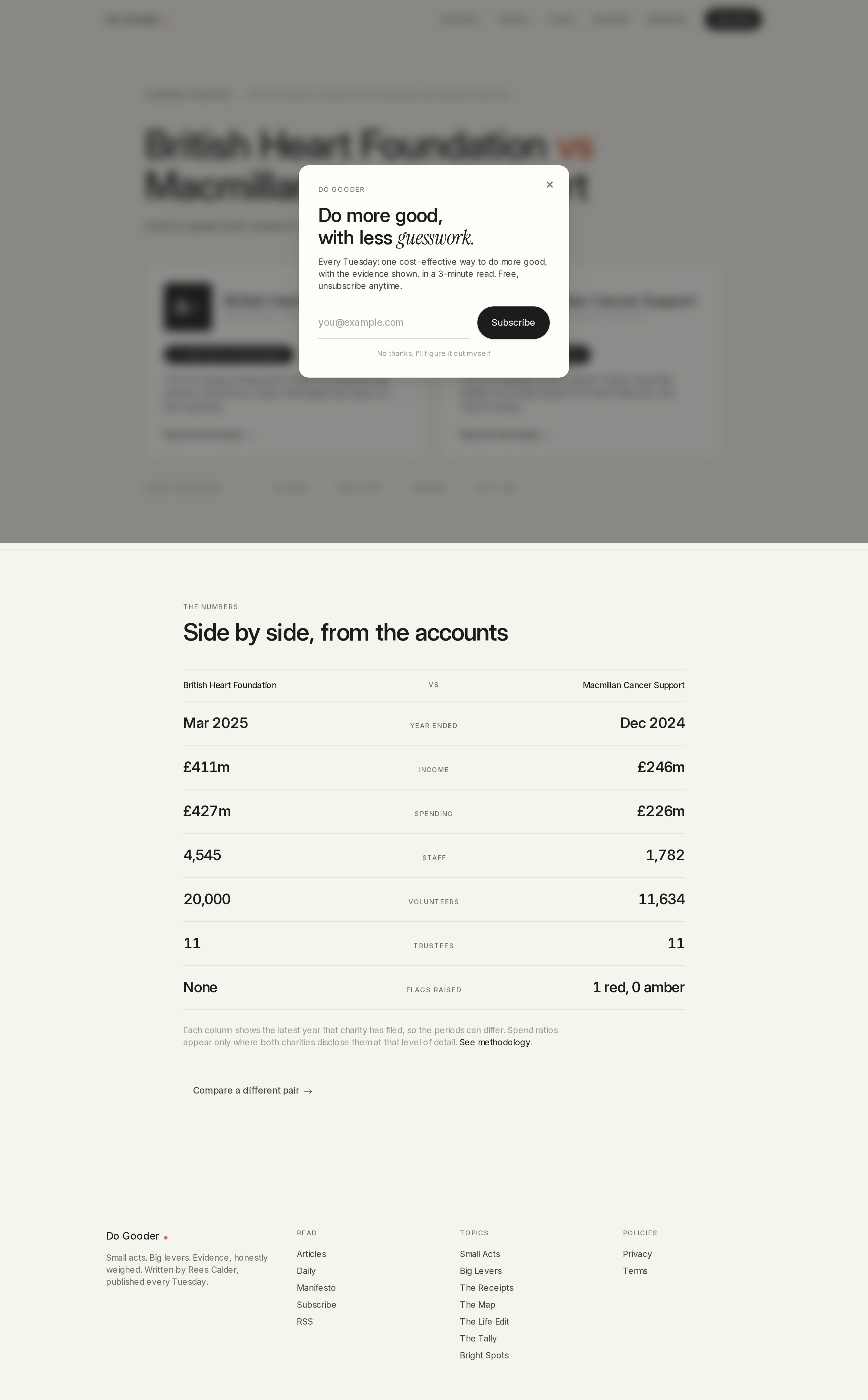
Everything factual on the site comes from the public register through the findthatcharity API, so no financial figure about any charity is typed in by hand. Fourteen major charities got a full research pass and a letter grade on top of that data. The flag engine is eight rules, six of them firing today and two waiting on a data layer, each with its threshold written out on a methodology page, which makes a flag something a reader can check instead of a verdict they have to take on trust. Ninety-one comparison pages, every pair of the fourteen, generate from that one list, with the canonical URL normalised so the two orderings of a pair cannot compete with each other. Every graded charity renders its own scorecard as a real PNG at request time, so a grade shared in a message arrives as the grade. The whole thing, 201 URLs, generates from typed sources with no CMS behind it.
What it looks like
What happened
The comparison pages are the part that worked. They pull double-digit click-through out of Google on the head-to-head queries they were built for, like "british heart foundation vs macmillan cancer support", the searches people run once they have already narrowed to two charities. The whole site, 201 URLs, generates from public register data with no CMS behind it, and every graded charity renders its own scorecard as a real PNG at request time, so a grade shared in a message arrives as the grade.
Provenance: Screenshots captured 2026-08-13 from live production at 1440px, DPR 2, unretouched, with no substituted data: every figure on screen is the charity's own filed number. Page counts measured 2026-08-13 against the live sitemap at do-gooder.co/sitemap.xml: 201 URLs, being 12 static, 7 pillar hubs, 77 articles, 14 receipts and 91 comparisons. Graded-charity count read from content/charity-research in LevityLeads/net-positive. Flag rules counted twice over: eight rule definitions in lib/charity/flags.ts, of which six are listed under "what we flag today" on the live methodology page and two under the pending data layer, so the headline metric counts the six that actually fire. Traffic from Google Search Console (sc-domain:do-gooder.co, 15 May to 12 Aug 2026: 12 clicks, 1,928 impressions, average position 34) and GA4 property 535765965 (180 sessions, 22 of them organic search). The search outage was confirmed on 2026-08-13 by direct request against do-gooder.co and against the upstream endpoint, and fixed the same day in commit 03fc8dc.
Want the same thing done to your operation?
Ten working days, a fixed fee, and one automation live before we finish. If there is nothing worth automating, I will say so in the findings.
Book a call